How Google Search is Helping Users Easily Access Content on Mobile
In Google Search, their goal is to help users quickly find the best answers to their questions, regardless of the device they’re using. Today, they’re announcing two upcoming changes to mobile search results that make finding content easier for users.
Simplifying mobile search results
Two years ago, they added a mobile-friendly label to help users find pages where the text and content was readable without zooming and the tap targets were appropriately spaced. Since then, they’ve seen the ecosystem evolve and they recently found that 85% of all pages in the mobile search results now meet this criteria and show the mobile-friendly label. To keep search results uncluttered, they’ll be removing the label, although the mobile-friendly criteria will continue to be a ranking signal. Google said “We’ll continue providing the mobile usability report in Search Console and the mobile-friendly test to help webmasters evaluate the effect of the mobile-friendly signal on their pages.”
Helping users find the content they’re looking for
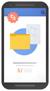
Although the majority of pages now have text and content on the page that is readable without zooming, Google recently seen many examples where these pages show intrusive interstitials to users. While the underlying content is present on the page and available to be indexed by Google, content may be visually obscured by an interstitial. This can frustrate users because they are unable to easily access the content that they were expecting when they tapped on the search result.
Pages that show intrusive interstitials provide a poorer experience to users than other pages where content is immediately accessible. This can be problematic on mobile devices where screens are often smaller. To improve the mobile search experience, after January 10, 2017, pages where content is not easily accessible to a user on the transition from the mobile search results may not rank as highly.
Here are some examples of techniques that make content less accessible to a user:
- Showing a popup that covers the main content, either immediately after the user navigates to a page from the search results, or while they are looking through the page.
- Displaying a standalone interstitial that the user has to dismiss before accessing the main content.
- Using a layout where the above-the-fold portion of the page appears similar to a standalone interstitial, but the original content has been inlined underneath the fold.
Examples of interstitials that make content less accessible
By contrast, here are some examples of techniques that, used responsibly, would not be affected by the new signal:
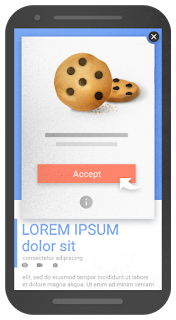
- Interstitials that appear to be in response to a legal obligation, such as for cookie usage or for age verification.
- Login dialogs on sites where content is not publicly indexable. For example, this would include private content such as email or unindexable content that is behind a paywall.
- Banners that use a reasonable amount of screen space and are easily dismissible. For example, the app install banners provided by Safari and Chrome are examples of banners that use a reasonable amount of screen space.
Examples of interstitials that would not be affected by the new signal, if used responsibly
Google previously explored a signal that checked for interstitials that ask a user to install a mobile app. As they continued our development efforts, they saw the need to broaden our focus to interstitials more generally. Accordingly, to avoid duplication in our signals, Google removed the check for app-install interstitials from the mobile-friendly test and have incorporated it into this new signal in Search.
Remember, this new signal is just one of hundreds of signals that are used in ranking. The intent of the search query is still a very strong signal, so a page may still rank highly if it has great, relevant content.


