Tag Archive for: web dev

The Art of Landing Pages and Home Pages

If you are involved in digital marketing, you’ve often heard the terms “landing page” and “home page.” But what are they exactly? Are they interchangeable or serve distinct purposes in a successful digital marketing strategy? And how can you optimize both to drive customer engagement and conversions? Let’s dive in and explore these topics.

What is a Home Page?

The home page is the digital ‘front door’ of your business. Visitors typically see the first page when they type your business URL into their browser. Its primary purpose is to provide an overview of your business and guide visitors to other sections of your website through navigation menus.

The home page must be comprehensive and appealing, as it serves a wide range of purposes – from informing first-time visitors about your brand and offerings to providing regular updates for returning customers. It’s a general-purpose page that links to all other important areas of your site.

What is a Landing Page?

A landing page, on the other hand, is a more targeted web page crafted with a single goal or call to action (CTA) in mind. It’s where a visitor ‘lands’ after clicking a specific link from an email, advertisement, or search engine result. These pages are often used in marketing campaigns to guide visitors toward a particular action, like signing up for a newsletter, purchasing, or filling out a form.

Unlike a home page, a landing page is designed to limit the options available to visitors, removing distractions and focusing their attention on the desired action. This focused approach can significantly improve conversion rates.

The Key Differences

While both landing pages and home pages are critical parts of any website, their purposes, audiences, and structures are distinct. Here are the key differences:

  • Purpose: The home page gives an overview of your business, while a landing page is focused on a single conversion goal.
  • Audience: The home page caters to a wide audience, including new and returning visitors. In contrast, a landing page is created for a specific segment of your audience who’ve shown interest in your ads or marketing emails.
  • Structure: The home page has a navigation menu linking to various sections of your website. A landing page has minimal navigation to reduce distractions and guide visitors to the CTA.

How to Excel at Both

Here are 3 of the best practices to excel at home pages:

Clear Navigation: Your home page should be easy to navigate, with clear menus that guide visitors to important areas of your website.

Compelling Value Proposition: Showcase your unique offerings and what makes you stand out. Your home page should quickly convey who you are, what you offer, and why visitors should choose you over competitors.

Engaging Design: An aesthetically pleasing design, combined with compelling content, can create a positive first impression and increase the time visitors spend on your website

Now that we’ve talked about the home page’s best practices let’s discuss landing pages:

Focus on One Goal: Each landing page should have a clearly defined goal. Whether downloading an eBook, signing up for a webinar, or purchasing, the entire page should be crafted around this goal.

Compelling Headlines and Copy: Use persuasive headlines and copy to convey the value of your offer. The copy should be easy to understand, highlighting the benefits of your offer and why visitors should act now.

Eliminate Distractions: Remove unnecessary navigation elements and links that could distract visitors from your primary goal. The simpler the page, the higher the chances of conversion.

Wrapping Up

Both home pages and landing pages play crucial roles in your digital marketing strategy. While they serve different purposes, understanding and optimizing these differences can significantly improve your online performance.

If you’re seeking assistance with web design, home pages, and landing pages, or need a guiding hand in sculpting a winning social media strategy, look no further! Onimod Global is your ultimate destination for a plethora of digital marketing solutions.

As proud Google Partners, come and explore our services, don’t hesitate to contact us today!

Simple Ways to Reduce Your Website’s Bounce Rate

If your website is struggling to generate traffic and leads, it could be due to a high bounce rate. While reducing bounce rate doesn’t automatically mean you’ll increase conversions, it could help. The ultimate goal is to increase engagement, user satisfaction and making it easier for them to find what they’re searching for. 

With that, here are 5 simple ways to improve your website’s bounce rate. 

What is Bounce Rate?

A bounce is a single-page session on your site. Is a high bounce rate a bad thing? According to Google, it depends on what determines the success of your website. For example, if users come to your homepage first but you want them to get to your sales page, then you don’t want a high bounce rate. A high bounce rate can also indicate that your visitors may not be engaged or satisfied with your site. Ultimately, we work to reduce bounce rate because it can also mean you’re making users happier and delivering them what they’re searching for. 

1. Increasing Page Speed

The longer a user has to wait for the site to load, the more likely they’ll leave. So, making your website faster is one of the easiest ways to reduce your bounce rate. Also, speed is a Google ranking factor, so it can help improve your SEO as well. Some simple ways to improve website’s page load speed is through: 

  • Optimizing images and video: Make sure they’re all sized appropriately and compressed. 
  • Leverage a caching, page speed plugin. 
  • Upgrading your web hosting package. 

2. Strong CTAs

No matter what your conversion goal is, the best way to improve your CTA is by including ranking keywords in the CTA itself. To accomplish this, you can go to the Google Search Console, determine what your pages are actually ranking for, take the top keywords and include them into the CTA. For example, if your conversion goal is to get visitors to download a white paper, your CTA would say “Download my white paper.” This is a lot more powerful than using a generic vocabulary. 

3. Use an Inverted Pyramid Writing Style 

If a person lands on your website from a search engine, it’s likely they’re searching for an answer for something. We want to draw them into your content and hook them in as soon as possible. With the inverted pyramid style of writing, you include the most important information in the beginning, then go into more details and give the least important information last. This also helps to create more engaging content that’s clean and has a good flow. 

4. Add Visual Appeal  

Visual content, such as photos and videos, always has higher engagement rates. This is due to videos and images being easier to consume than standard text. If you have a longer piece of content, it’s best to try to turn that into video form. It’s more likely for users to watch a long video than read a long blog, for example. It’s also easier to draw people in with visual content. And hopefully, once you’ve drawn them in, you can get them to convert. 

5. Make Site Search Simple

Lastly, it’s important to make it easy for users to search your site. If you can provide an easy search experience for users, it’s less likely they’ll bounce back to Google to search elsewhere. The longer you can keep them on your site, the more engaged they are and the more opportunity you have to persuade them to convert. 

Contact Onimod Global

Struggling to make your landing page convert or just need some digital marketing advice? Contact us! We are experts in all things digital marketing including SEM, Web Dev, Automation, Analytics, and much more. Learn more about what we do here, or keep up to date with all things digital marketing on our news page.


10 Ways to Audit Your Website to Increase Your Search Rankings

When it comes to SEO, consistent tracking, testing and measuring is crucial to verify your strategies are effective. This includes auditing your website to ensure there are no errors holding you back. 

Here is a checklist of 10 things to audit on your website that can help increase your search engine rankings. 

1. Make sure your pages can be indexed. 

The most crucial aspect of SEO is making sure your pages can be found. You never want to block important pages by mistake. To ensure all your pages are available to be found you should: 

  • Check your index status on Google. Use the index status report in your Google Search Console to see the number of pages Google has crawled from your domain. You want to see that the page count has continued to increase over time. 
  • Check your robot.txt file. Do this by adding /robot.txt to the end of your domain to ensure there are no pages that are “disallowed.” 
  • Review site and URL errors. This is something you can also do through your Google Search Console. Locate the site and URL errors report and see if there are any problems. 
  • Search your website. Simply do a Google search for site:yourdomain.com and you can retrieve a list of indexed pages. 

2. Secure your website. 

In  a recent update, Google announced that it favors websites encrypted with HTTPS. So if you haven’t already, now is the time to make the switch. HTTPS provides encrypted communication with a web server. You can secure your website with HTTPS using SSL.  

3. Check your meta data. 

When pages are crawled by search engines, Noldex meta tags can occasionally be inserted. As a result, this will block Google. Check the source of a page for the code <meta name = “robots” content =”noindex”> and make sure this does not exist on your pages. 

4. Check your link profile. 

A large part of SEO success depends on earning links from trusted domains. You can conduct a complete backlink audit through Google Search Console, Ahrefs or SEMrush to track your backlinks and monitor your progress over time. 

5. Optimize page load times. 

Every digital marketer is aware that search engines favor faster sites. Not only that, but a slow site increases the likeliness of visitors bailing early. You want to aim your page log time in 3 seconds or less. Here are some tips for optimizing site speed: 

  • Use speed testing tools. 
  • Evaluate WordPress plugins. 
  • Reduce image file size for optimum performance. 
  • Remove any redirect chains. 
  • Speed up your Javascript. 

6. Eliminate any duplicate content. 

Duplicate content dilutes the authority of the primary URL and threatens the capability of your search rankings. Be sure to use canonical link tags to combat things. This lets Google know which is the primary URL to pages containing duplicate or similar content. 

7. Remove low valued pages. 

You want to ensure pages that are indexed by Google contain rich, original content and relevant keywords. You can accomplish this by de-indexing low valued pages. You obviously need campaign-specific landing pages, but if they’re not robust pages, they only harm your search rankings. Remove them from the index and redirect these pages to content-rich URLs by using a 301 redirect. 

8. Generate useful links. 

A well-planned internal link structure brings a number of benefits to your overall search rankings. Here are some additional tips for optimizing your site’s link structure for SEO. Also be sure to use descriptive anchor text, making links that feature the same keywords as the page they link to.  

9. Optimize for mobile. 

Google has been favoring mobile-first site designs for a while now, meaning it’s critical to appear in mobile searches. A few ways to ensure your site is optimized for mobile is by: 

  • Using responsive design. You can update your site to feature responsive design that creates an optimum experience regardless of screen size. 
  • Using Google’s testing tool. The Google Search Console offers a mobility usability report that identifies problematic pages and gives you a score for mobile friendliness. 

10. Master the basics. 

Continue to implement the fundamental SEO tactics, such as: 

  • Using unique title tags. Be sure to write unique title tags that include a keyword phrase to accurately describe the topic of your pages. 
  • Implementing relevant keywords. Always include keywords you’ve selected in your headings, subheadings, body copy and URL appropriately. 
  • Creating meta descriptions. Lastly, indexed pages should always include a meta description that features keywords to encourage readers to click through. 

More from Onimod Global 

Struggling with your SEO or any area of digital marketing? Contact the experts. We specialize in SEO and helping our clients dominate organic search and map results. Learn more about us and contact us today!

5 Steps to Creating a High Converting Landing Page

Customers arrive on a landing page through social media posts, paid advertisements, and various other content. If your landing page is ineffective, all the ad dollars and resources put towards getting these customers there was essentially a waste.

A quality landing page has the potential to increase leads, sales, and gain valuable information on potential customers. Creating highly effective landing pages can seem like a difficult task, as there’s no one-size-fits-all template, but there are a variety of landing page best practices. These combined with understanding your target audience and dedicated effort, building a high converting landing page will be much easier. 


1. Focus on Responsive, Mobile-Friendly Designs 

In 2018, 52.2 percent of all website traffic worldwide was generated through mobile phones. No matter the industry, it’s smart to make mobile design a priority. This means using: optimized images, shorter sentences, bullet points, headings, and subheadings. Mobile-optimized landing pages include a lot of white space and can be easy to read at a quick glance. Performance is also important, as conversions won’t be likely if page speed is low or chew up data. 

Mobile-optimization also forces conciseness and high design focus. Screen space can’t be wasted on extra unimportant content or fluff. The message should be focused on the action you want the customer to take. The less-is-more design approach results in a more concise and engaging final project. 


2. Have One Clear Call-To-Action 

The call-to-action is the number one, most important element that should be included on every landing page, as it’s what turns visitors into real customers. 

What should be focused on first is the text. Powerful, direct, and urgent language is key. What makes you unique and would create an emotional drive in customers? If possible try to communicate one or more of the following: they are getting something for free, they are getting something exclusive, you are solving their problem, or they have limited time to act. 

Some other elements that increase the effectiveness of call-to-actions are contrasting colors, buttons instead of links, and ensuring its visibility. Most companies and sites have a set color scheme, which is great, but you don’t want your CTA to blend in. Make it stand out by using contrasting, yet visually appealing colors. It also doesn’t need to be at the bottom of the page. It should be placed where the user’s eye naturally goes. This is something that may require A/B testing. 


3. Use Visuals 

The brain processes images 60,000 times faster than text. Meaning that visitors are immediately affected by the images on the landing page. As pictures are selected and placed, remember that they should be relevant to products and services, and high quality. 

If you’re selling a physical product, a high quality image should be displayed on the landing page. If you’re selling a service, the primary purpose of the image is to grab users’ attention and demonstrate relevance to them. 

And since the images are the first thing the user processes, you want that impression to be a good one. It has the potential to shape the visitor’s impression of your brand before they even make it to the ad copy. Which is why this isn’t a great place to use stock photos or quick photoshop jobs. Marketers have the opportunity to give potential customers a visual understanding of what they stand to gain with their product or service, and set themselves apart from the competition.


4. Have User and Search Engine Friendly Formatting 

Along with a mobile-friendly design and quality content, the page also needs to be formatted well, starting with a solid headline. It should compelling, something that will keep visitors reading. Touch on a main point that’s relevant to readers and hints that you have a solution to their problem. It’s also beneficial to use emotional power words. The most effective emotions to appeal to are anger, greed, and fear. “Stop getting ripped off!” “Free exclusive gift!” “Only 24 hours left!” are all possible headers appealing to these emotions. 

After you’ve established a heading that meets all the criteria, break the rest of the content of the landing page into segments. Each segment should have a subheading of its own that makes sense. This way if a reader is skimming the page they can skip to the section they’re looking for or read what is most relevant for them. Not only are headings and subheadings helpful for visitors, it helps search engines as well. Landing pages can be more easily indexed by Google and other search engines when they’re logically structured. 


5. Show You’re Reliable 

High converting landing pages always contain an element of trust. Include various pieces of evidence that show you can be trusted and are a reliable company, since you’re most likely asking visitors to give up some kind of sensitive information. There are five types of evidence best used to show trustworthiness.

The first is high quality landing page copy. There should be absolutely no spelling or grammatical errors. This makes visitors wary because it seems unprofessional, gives the sense that the website was thrown together, and thus unreliable. There are many tools that can help with spelling, grammar, and guides for clear landing page copy.

Proof of expertise and experience is also essential for reliability. Things such as: established in 1995, over 50,000 satisfied customers, licensed in 50 states, officially certified, member of the local Chamber of Commerce, etc, all communicate an important message. It reassures potential customers that your company is experienced, qualified, and have taken the prerequisites to earn and deserve your trust. 

Social proof, direct and indirect, is great evidence. Indirect includes social media follows, number of subscribers, likes, and shares. The more social engagement you have, the more trust you can earn. Indirect social proof can also be things like reported revenue, employee size, and other factors that bring your business clout. Direct social includes positive reviews, testimonials, and positive quotes from customers or influencers in your niche. It’s one person telling others “I had a good experience,” The simple truth is, trust begets trust.

Personal connection is next. Earn visitors trust by letting them get to know you and your business. This could be things such as a personal story, video, company bio, history, photos, etc. It helps when customers can put a name and face with who they’re doing business with. 

Lastly, evidence of security is very important. Most IT and security software vendors will give badges to their customers. You should place those on landing pages to indicate to customers that you have taken steps to ensure they’re information is protected, especially when it comes to personal or financial data. 


Contact Onimod Global 

Struggling to make your landing page convert or just need some digital marketing advice? Contact us! We are experts in all things digital marketing including SEM, Web Dev, Automation, Analytics, and much more. Learn more about what we do here, or keep up to date with all things digital marketing on our news page


5 Important Questions to Ask Your Website Development Agency

There are numerous questions that an organization may have when outsourcing a website development project to an agency. Investing in a new website is no small expense for a business owner, so addressing any questions that arise is a must. With our previous website development work at Onimod Global, there have been many questions we have received from clients over the years. Listed below are just a few critical questions that every business should ask their agency when it comes to a new website development project.

1. What does the previous work look like with other clients? 
Knowing what an agency is capable of when it comes to their website development expertise is extremely important. Request case studies from agencies to see what an agency has to offer in terms of website development, and what benefits can be provided for your organization. Click Here to view our previous website development work and case studies at Onimod Global. Ultimately, conduct research on multiple agencies to ensure the one you select is legitimate and will produce the final product you are looking for.

2. Is Google Analytics being utilized to track data and set up goals? 
Ensuring that a Google Analytics tracking code is installed to a new website is crucial and it’s amazing as to how underused this tool is by many businesses today. One major benefit that Analytics provides is where website traffic comes from and what adjustments can be made. Setting up goals in Analytics to track certain conversions like form completions and downloads is another critical aspect that Analytics provides. Essentially, being able to monitor general website traffic information is huge and implementing Google Analytics should always be a step in the website development process.

3. Will the website be optimized to increase online visibility? 
Regardless of the objectives an organization desires for their website, online visibility and being able to drive traffic should always be a priority. Therefore, if a site is not optimized for search engines how will it drive traffic? Ensuring that a website is highly optimized will require a lot of SEO knowledge and time. There are many components of SEO that involve “on page” optimization like paying attention to title tags, content, meta descriptions, keywords, and internal link building. There are also “off page” optimization tactics like blogging and utilizing local directory sites. In the end, having a highly optimized website is a must and be certain that the agency developing your website is familiar with these practices.

4. Is the Google Tag Manager being used?
Application of a tag management system like the Google Tag Manager to a website is extremely beneficial for any organization. In technical terms according to Google, the Tag Manager “replaces hard-coded tags on a website with dynamic tags that are easier to implement and update.” Tag management systems like Google’s provide multiple benefits such as adding AdWords, Analytics, and even third party tags instead of having to manually edit the site code. Therefore, this reduces errors and allows the simple deployment of tags on a website, so be sure to address this area of concern with your agency.

5. What does the timeline look like until the site officially launches? 
It’s important to be on the same page with your agency about the development of a timeline and what the expectations are. Depending on the complexity of the site a website development project can take anywhere from months to years. It’s essential to stay in contact with your agency throughout the entire process as new requests may arise and an agency should always be adaptable to client changes. An experienced team like ours at Onimod Global has worked together on multiple web dev projects and understand how important client timelines are.

Contact Us: If you’re a business seeking an upgrade in website development, feel free to reach out to our expertise at Onimod Global and check out Our Work. We look forward to hearing from you!

Client Website Launch: Midwest Solar Control

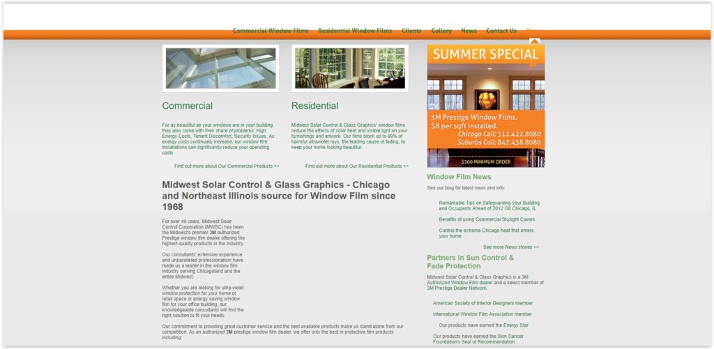
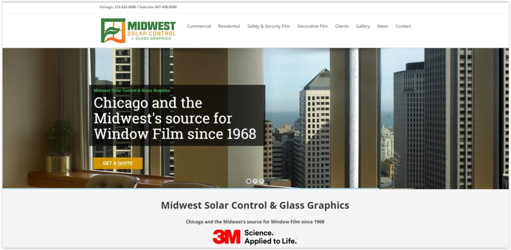
Midwest Solar Control (midwestsolarcontrol.com) is the Midwest’s premier 3M Authorized Prestige window film dealer offering the highest-quality products in the industry. In need of a new website and better SEO presence, our website development expertise at Onimod Global has taken Midwest Solar Control to the next level.

Objective:
To build Midwest Solar Control a highly functional website from scratch with engaging content and an enhanced SEO presence. At the same time we wanted to ensure device accessibility through Responsive Web Design. Midwest Solar Control didn’t just need an appealing website, they needed to showcase their window film expertise and generate as many new business leads as possible.

Onimod Global’s Strategy:
We implemented an effective Website Development and SEO strategy to develop a highly responsive website. We built a robustly designed and developed website that empowers Midwest Solar Control to attract clients and create a user friendly experience.

Old Website:

Current Website:
Chicago website design agency


Massive Upgrades
:

  • Enhanced on-page Call to Action Tools
  • Enhanced SEO Presence
  • Custom Design
  • Increased Security
  • Mobile Responsive Upgrade
  • Custom Back-end for easy client-side updates.
  • Clear Navigation
  • Enhanced on-page Menus
  • Advanced Firewall
  • Job Application Portal
  • Accelerated Mobile Pages (AMP)
  • Full-width Image and Transparent Headers
  • Redesigned News section


Contact Us
: If you’re an organization like Midwest Solar Control seeking an upgrade in website development or any other digital marketing services, feel free to reach out to our expertise at Onimod Global on our Contact Us page. Also be sure to check out our other work by viewing our Case Studies!

4 Reasons Why Having a Professional Website is Critical for Any Business

Having a professional website for any business in today’s market is a crucial recipe for success, yet it’s amazing how many organizations have low quality websites or nothing at all. There are multiple reasons why companies should have a professional looking website, and this post will explore a few of them. With our website development expertise and experience here at Onimod Global, here are four reasons why we think professional websites for businesses are critical.

1. Credibility:
A lot of times a potential consumer’s first impression of a business comes from their first visit to a website. Therefore, having an appealing and professional website can “make or break” consumers impressions. Regardless if your organization is superior to competitors or not in terms of a product or service, consumers perceptions may think otherwise when one website is more professional than the other. One final point to make regarding credibility is that it gives a business an opportunity to showcase previous work, who their clients are, and provide convincing testimonials.

2. Cost Efficiency:
Many business owners have the belief that professional looking websites are expensive, therefore not willing to make any investments. This mindset is wrong is so many ways. Yes there are fees involved like hosting, domain, outsourcing expenses, etc. but the investment is a must and not as big as owners believe. Ultimately, refusing to adapt in a digital world by not investing in a professional website is a mistake, as it will end up costing more in the long run.

3. Visibility:
Social media pages and word of mouth advertising are great, but an appealing website will take a business to the next level. Online traffic and the number of daily searches on search engines (Google especially) are through the roof in today’s digital world. Moreover, having a high functioning website will enhance the overall visibility of an organization and greatly increase the ability for potential consumers to find you.

4. Convenience:
In addition to increased visibility, convenience is another reason to invest in a professional website. Smart organizations have figured this out and adapted. Consumers aren’t driving around anymore looking for places to shop for example. Instead they are shopping online or conducting searches on where to go. The accessibility that websites provide for potential consumers is invaluable. Another relevant aspect to point out involves the evolution of smart phones. Smart phones have made online searches as convenient as ever before, so this further proves the importance of having a professional website in today’s competitive market.

Contact Us: If you’re a business seeking an upgrade in website development or any digital marketing service, feel free to reach out to our expertise at Onimod Global. Check out our previous work and case studies by CLICKING HERE. We look forward to hearing from you!

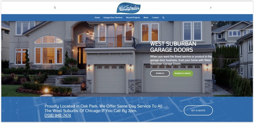
New Client Website Launch: West Suburban Garage Doors in the Chicagoland

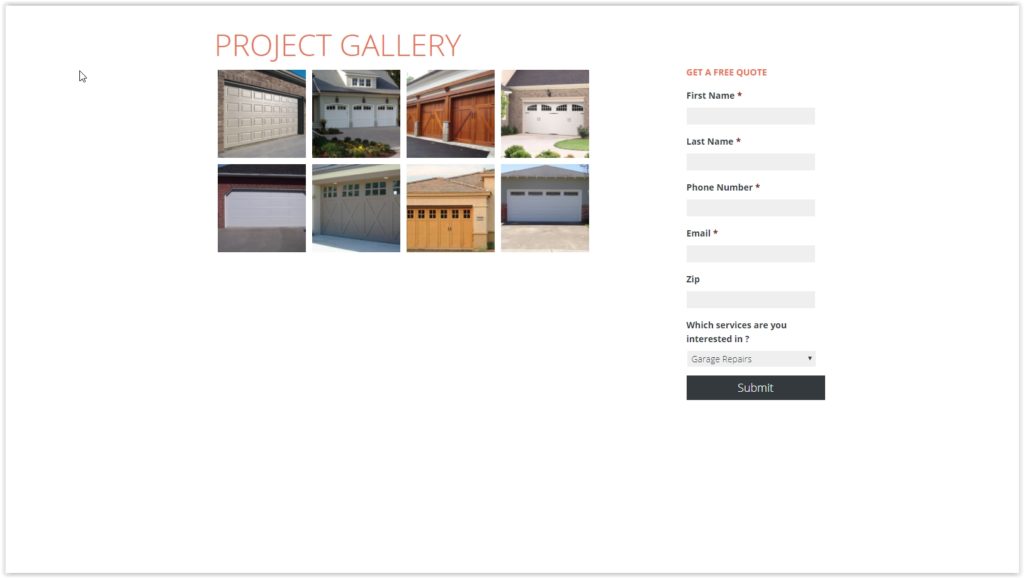
West Suburban Garage Doors (westsuburbangaragedoors.com) is a garage door services company serving areas of the Chicagoland including Oak Park, Hinsdale, Elmhurst, Downers Grove, and other cities. In need of a new website and better SEO presence, our website development expertise at Onimod Global has taken West Suburban Garage Doors to the next level.

Objective:
To build West Suburban Garage Doors a highly functional website from scratch with engaging content and an enhanced SEO presence. At the same time we wanted to ensure device accessibility through Responsive Web Design. West Suburban didn’t just need an appealing website, they needed to showcase their garage door expertise and generate as many new business leads as possible.

Onimod Global’s Strategy:
We implemented an effective Website Development SEO strategy and API Integration to develop a highly responsive website. We built a robustly designed and developed website that empowers West Suburban Garage Doors to attract clients and enable them to become consistent conversions.

Old Website:
West Suburban Garage Doors

Current Website:


Massive Upgrades
:

  • Enhanced on-page Call to Action Tools
  • Parralex Effect backgrounds
  • Enhanced SEO Presence
  • Mobile Responsive Upgrade
  • Custom Design
  • Enhanced on-page Menus
  • Advanced Firewall
  • Custom Back-end for easy client-side updates. 
  • Accelerated Mobile Pages (AMP)
  • Full-width Image Headers
  • Increased Security
  • Job Application Portal
  • Clear Navigation
  • Redesigned News section
  • 2 Color Transparent Header


Contact Us
: If you’re a ROI driven business like West Suburban Garage Doors seeking an upgrade in website development or any other digital marketing services, feel free to reach out to us at Onimod Global on our Contact Us page. We look forward to hearing from you!

Recipe For Success: How to Utilize Digital Marketing in the Food Industry

Every industry is different. While some digital marketing objectives may be applicable over a wide variety of products and services, there are some areas in which a specialty is needed.

One of our successful clients, Theory, is an upscale sports lounge in downtown Chicago. Theory goes above and beyond in order to stay ahead in the highly competitive food industry. Offering excellent food, style, service, and all around comfort, this is definitely not your average sports bar.

You may be wondering, how does this company stay ahead of the curve? The answer my be hiding in their digital marketing tactics.

SEO

Keyword Lists: Experimenting and tweaking different groups of keywords and search terms is essential to figuring out what will work best for your business. But first, you have to start with a wide range of options.

Be sure to include several different types of keywords throughout your website and advertisements. Broad match, niche-specific, and individual brand terms can all help drive traffic to your restaurant.

Keep it Local: Try to keep many of your marketing strategies centered around local consumers. After all, these are the people who are going to be the lifeblood of your business.

Gain as much ground as possible on local directories. Google My Business is an incredible resource. Listing your company through Google will immediately boost its awareness. You definitely want your business to pop up when someone does a local search for “food near me.”

Social Media

Platforms like Facebook, Instagram, and Twitter are all hugely influential to customers in the food industry. Impactbnd.com compiled 49 statistics on social media. The following stats highlight the incredible affect social media can have on your brand:

  • In 2015 Facebook influenced 52 percent of consumers’ online and offline purchases, up from 36 percent in 2014.
  • 68 percent of Instagram users engage with brands regularly, and Instagram has 58 times more engagement per follower than Facebook.
  • 67% of Twitter users are far more likely to buy from the brands they follow on Twitter.

Website Optimization

Every real business needs an equally real website. A “real” a site can direct users and help to answer their most common questions.

More basic questions consist of “what is your address, phone number, and business hours?” Slightly more complicated questions may include, “are you available to cater special events or reserve a room for a private event?” All of these questions should have an answer that is clearly stated on your website.

The user experience should also be clear and efficient. A customer should be able to navigate your website with ease, both on a desktop or mobile device.

The overall visual appeal of a site is also incredibly important. If a potential customer is not pleased with photographs of your business and the food it offers, then they are very unlikely to order anything off of your menu.

No one gets a second first impression. Make sure that your restaurant gathers all the right kinds of attention with a spectacular website.

Case Study

Onimod Global was able to work with Theory of Chicago on each of these aspects. We used our expertise to build a new website, pack it full of SEO content, and spread the word about their incredible services across all major social media platforms. Take a deeper look into this project by viewing the Theory case study HERE.