5 Signs Your Website Needs a New Design
In today’s digital world, your website isn’t just a place on the internet—it’s your storefront, your business card, and your best salesperson all rolled into one. But just like a physical store needs a fresh coat of paint and updated displays from time to time, your website might also need a makeover to keep up with the times and meet the expectations of your visitors.
Here are five signs that it might be time to consider a redesign:
1. Outdated Appearance
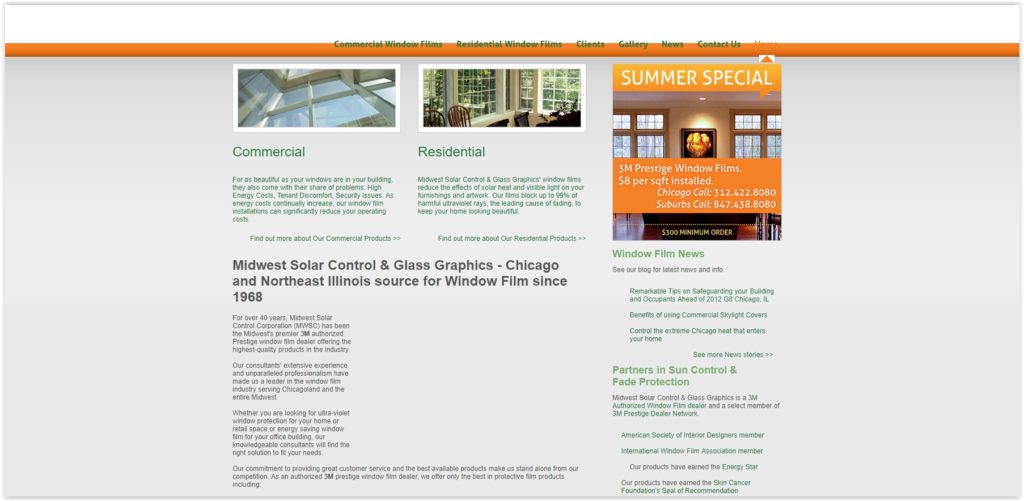
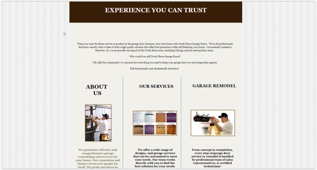
Think of your website as the face of your business online. If it looks like it hasn’t been touched since dial-up internet was a thing, it could be turning away potential customers. An old-school design can give the impression that your business isn’t up-to-date or reliable. According to a study by Stanford, 75% of users admit to making judgments about a company’s credibility based on their website’s design.
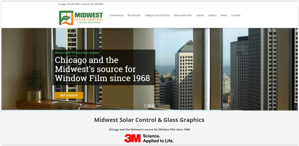
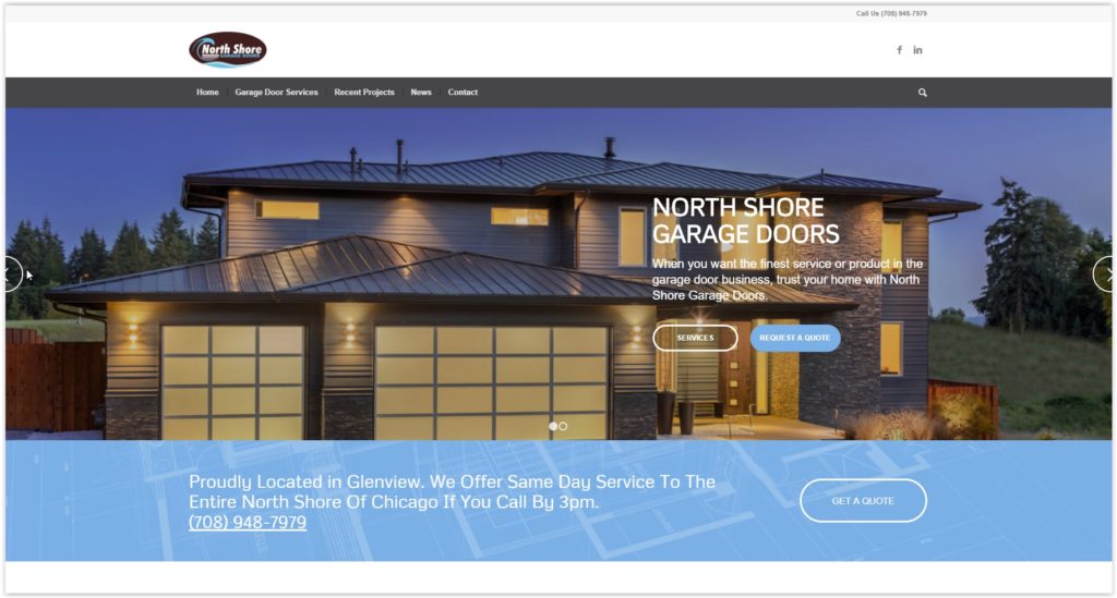
Why it Matters: A modern, visually appealing design not only looks good but also shows visitors that you care about your brand and their experience. It builds trust and encourages them to explore further.
What to Do: Consider updating your design with current trends in mind. Fresh colors, clean layouts, high-quality images, and a cohesive style that reflects your brand’s personality can make a world of difference.
2. Poor User Experience (UX)
Ever been to a store where you couldn’t find what you were looking for, and the aisles were confusing? Websites can feel the same way if they’re hard to navigate or slow to load. If visitors struggle to find information or complete simple tasks, they’re likely to click away. According to fitsmallbusiness.com, the return of investment (ROI) of spending on UX is 9,900%
Why it Matters: A smooth, intuitive user experience keeps visitors engaged and encourages them to spend more time on your site. It’s like guiding them through your store and showing them exactly what they need.
What to Do: Take a step back and look at your website from a visitor’s perspective. Simplify navigation, improve loading times, and organize content so it’s easy to find. The easier it is for people to use your site, the more likely they are to stick around.
3. Slow Loading Speed
In a world where everyone expects things instantly, waiting for a website to load can feel like an eternity. According to Google, 53% of mobile users abandon sites that take longer than three seconds to load. Slow loading times frustrate visitors and could send them straight to your competitors who offer a faster experience.
Why it Matters: Speed isn’t just a convenience—it’s a big factor in whether visitors stay or leave. A fast-loading site keeps people happy and helps your site rank better in search engines, bringing in more visitors over time.
What to Do: Optimize your website for speed. Compress images, clean up unnecessary code, and consider using a content delivery network (CDN) to serve your site’s content faster. Your visitors will thank you with longer visits and more conversions.
4. Non-Responsive Design
Imagine trying to read a billboard while squinting because it’s too small. That’s how visitors feel when they visit a website on their phone or tablet that isn’t designed to fit their screen. A responsive design adjusts to whatever device someone is using, ensuring a seamless experience.
Why it Matters: More and more people browse the internet on their phones. If your site isn’t mobile-friendly, you’re missing out on potential customers who will quickly move on to a site that is.
What to Do: Invest in a responsive redesign that adapts your site’s layout and content to different screen sizes. Make sure buttons are easy to tap, text is readable without zooming, and everything works smoothly on every device.
5. Low Conversion Rates
Ultimately, your website should help you achieve your business goals, whether that’s making a sale, capturing a lead, or getting someone to sign up. If visitors aren’t taking action and converting, it’s a sign that something in your design might be holding them back. Businesses that update their website design regularly are 50% more likely to see increased return on investment (ROI).
Why it Matters: A well-designed website guides visitors toward your goals. Clear calls-to-action, easy-to-use forms, and a layout that naturally leads people through the buying process can make a big difference in your conversion rates.
What to Do: Analyze your website’s performance. Look at where visitors drop off, test different calls-to-action, and make sure every page serves a purpose in moving people closer to conversion. A redesign focused on improving these areas can turn more visitors into happy customers.
Conclusion
Your website is your digital handshake with the world. It’s often the first impression potential customers have of your business, and you want to make it count. If you’ve noticed any of these signs—whether it’s an outdated look, frustrating user experience, slow loading times, lack of mobile friendliness, or low conversion rates—it’s probably time to consider a redesign.
Investing in a fresh, user-friendly website not only enhances your brand’s image but also shows visitors that you’re committed to providing them with a great experience. It’s like giving your storefront a facelift to attract more foot traffic and convert more browsers into buyers.
Ready for change? We are your in-house web dev team. Rely on us for new project development or website maintenance. We can do it all – Websites built by a Digital Marketing firm with Search Engine Rankings in mind.
We analyze data from Traffic Sources and Visitor Flow to establish the routes people take to reach you, the devices they use to get there and what they do on your website. Utilizing this information allows us to build highly engaging, search friendly websites for your business.
Contact us today to start giving your website the attention it deserves.


